
Insights
Color Theory for Presentations: The System That Makes Decisions Faster
•
7 Minutes

Most teams pick slide colors to look "on-brand."
But in a decision meeting, color has one job: tell the audience what matters first, and what it means.
If your palette doesn't create hierarchy, your message competes with itself. Every "highlight" becomes noise. Every chart becomes debatable. And your ask becomes "let's revisit this."
Effective color in presentations isn't talent. It's a system. Below is a practical framework to build a palette that improves readability, strengthens credibility, and guides the room toward a decision.
The Hidden Cost of Bad Color Is Delayed Decisions
When color is inconsistent, your audience spends time decoding the slide instead of evaluating the idea.
That shows up in predictable ways. Meetings run long because people lose the thread ("Wait, what does blue mean again?"). Confidence drops quietly when a slide looks cluttered, even if the numbers are solid. Charts get misread because color implies meaning whether you intended it to or not. And the ask gets buried, because the "next step" visually competes with everything else on screen.
Color isn't decoration. It's attention design, and attention is the gatekeeper to conversion.
If Everything Is Highlighted, Nothing Is
Brand palettes get sprayed across slides: backgrounds, headings, shapes, icons, charts, all competing at equal volume. It looks thorough. It kills clarity.
Decision-makers don't read slides. They scan for structure. When color doesn't create a visible hierarchy, scanning fails. The eye doesn't know where to land, the narrative breaks, and discussion drifts.
The fix is a signal hierarchy with three layers: a neutral base for most of the slide (backgrounds, containers, dividers), one primary signal color for the single thing you want noticed, and one secondary signal color for comparisons or the next priority. Everything else stays quiet.
What this looks like in practice: a slide where the takeaway headline is high-contrast, one callout element carries your signal color, and all supporting elements are neutral. The eye lands where you want it, fast.

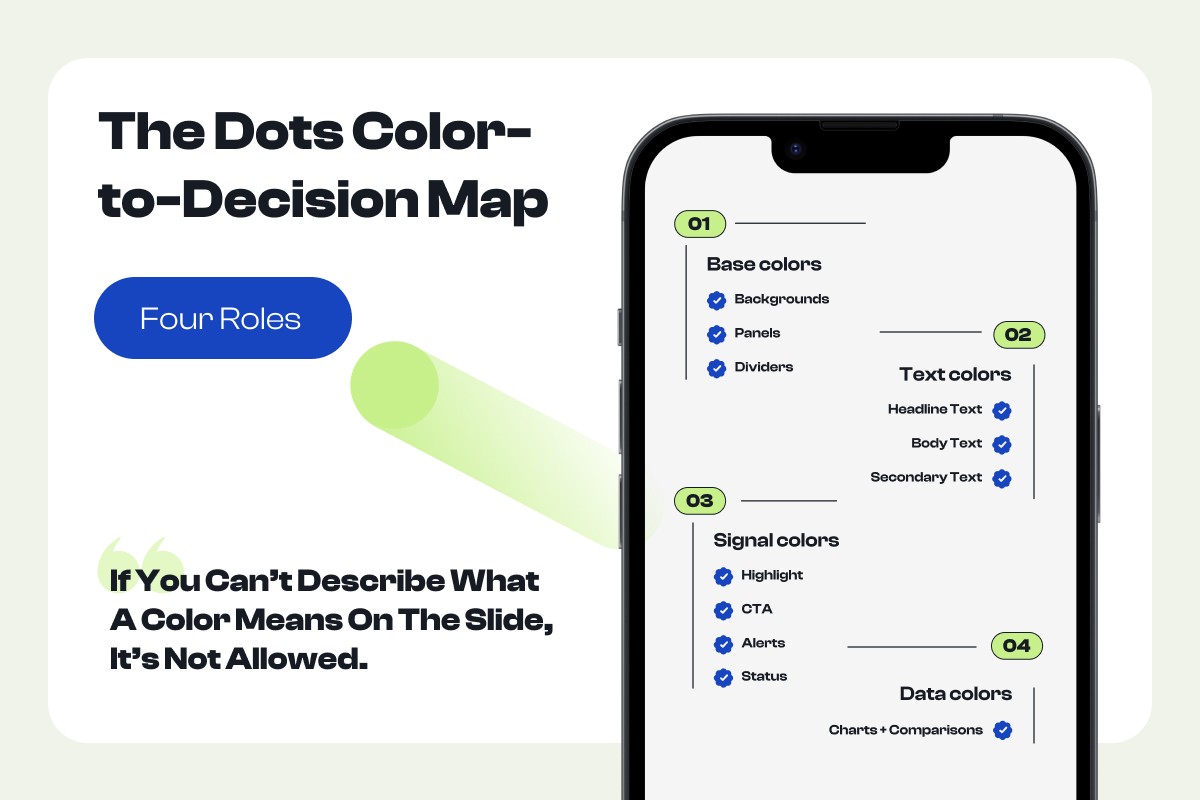
Your Palette Needs Roles, Not Just Colors
Most teams choose colors like this: "We need five brand colors." High-performing decks choose colors like this: "We need four roles."
This is the Dots Color-to-Decision Map:
Base colors handle backgrounds, panels, and dividers. These are the quiet scaffolding of the slide.
Text colors form your contrast ladder: headline, body, and secondary text, each at a different weight so hierarchy is visible at a glance.
Signal colors carry meaning: highlights, CTAs, alerts, and status indicators. This is where you draw attention intentionally.
Data colors serve charts and comparisons. Consistent mapping here is what makes a deck readable as a whole, not just slide by slide.
The reason roles work where random palettes don't: the audience learns your visual language once, and then every slide builds on that understanding instead of re-teaching it. One rule ties the system together. If you can't describe what a color means on the slide, it's not allowed.
Contrast Is Credibility (and Accessibility Is Revenue Protection)
Low contrast is more than a design flaw. It's a comprehension tax.
Light text on light backgrounds. Muted chart colors. Thin lines. Subtle labels. People won't tell you they can't read your slide. They'll disengage, multi-task, or ask shallow questions. The room's confidence in your work drops, quietly, before you've finished presenting.
Set non-negotiable contrast rules and build them into your system. Body text must be readable from the back of the room, and on mobile. Never use color as the only indicator of meaning: pair it with labels, shapes, or icons. Reserve high saturation for what it's meant to signal: CTAs, risk flags, deltas, "this matters."
The output is a contrast ladder that becomes your default across every deck:
Headline: highest contrast
Body: high contrast
Secondary: medium contrast
Background/UI: low contrast
Once that ladder is set, consistency stops being a discipline and starts being a system.

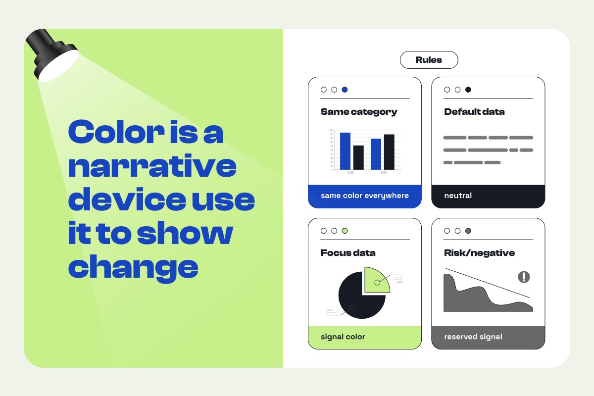
Color Is a Narrative Device: Use It to Show Change
Most business decks argue for movement: growth, risk reduction, prioritization, trade-offs. Color should make that movement obvious.
The common failure is random color in charts. Each slide uses different colors, different legends, different emphasis. The audience can't track what they're comparing, so the narrative has to work harder than it should.
The fix is consistent mapping: same category, same color everywhere; default data in neutral; focus data in signal color; risk and negative data in a reserved signal used sparingly. A quarterly trend chart where the baseline series stays neutral and the story series is highlighted consistently across every slide, that's a deck where the argument builds. The color works with the narrative, not against it.
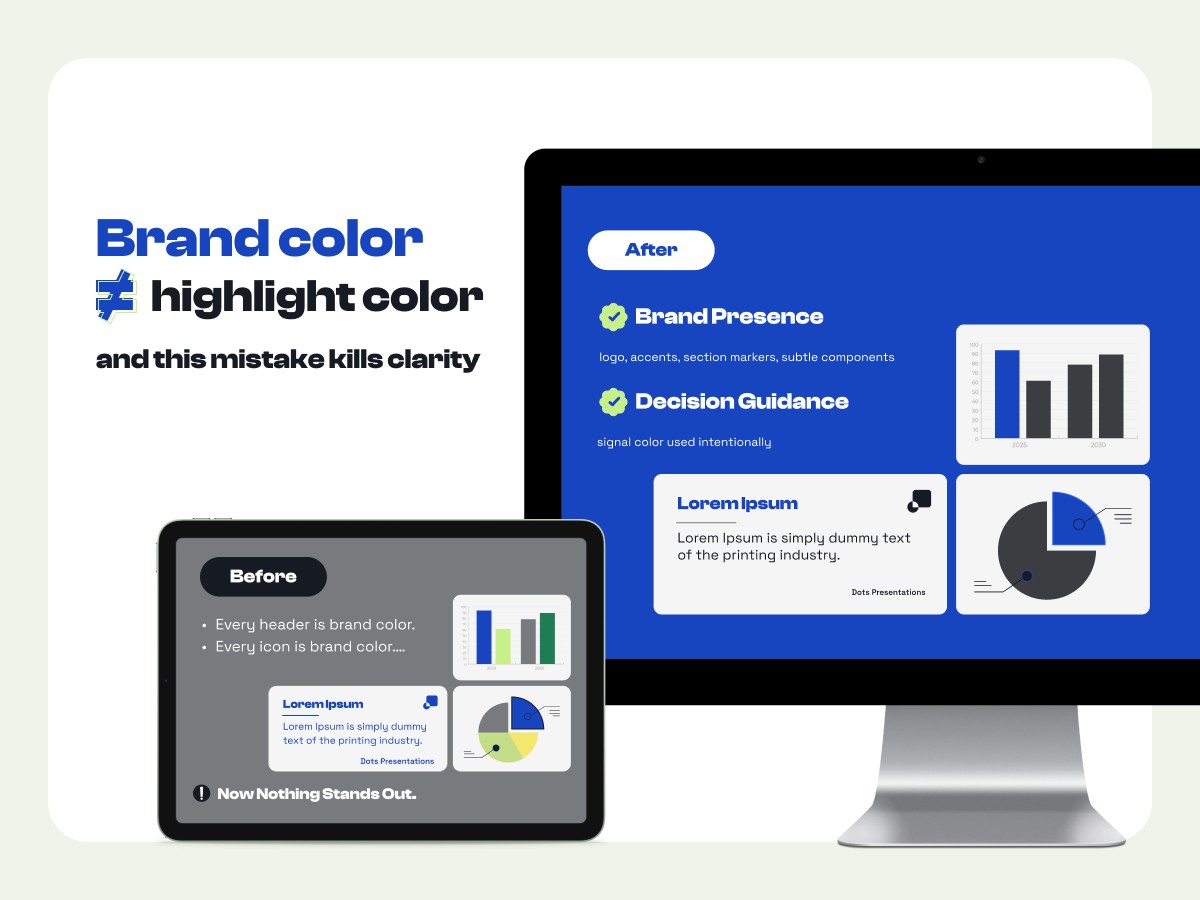
Brand Color Does Not Equal Highlight Color
This is the mistake that makes decks feel visually loud. Your brand's primary color is often too saturated to be used everywhere. When every header, icon, and chart series carries that same color, nothing stands out. The deck becomes harder to read, and loud decks feel less executive.
The fix is a clean separation between two different jobs.
Brand presence is the logo, accents, section markers, and subtle components. It's the quiet signal that says "this is us."
Decision guidance is the signal color used intentionally to direct attention toward what matters right now.
When brand and signal compete for the same real estate, decision guidance loses. Keep them separate and your deck reads as both credible and clear.
Quick Win: Build a One-Slide "Palette Test" Before You Redesign the Whole Deck
Before applying a new palette to 40 slides, test it on one. Run this checklist on the slide that has to land:
The 5-second scan test: Can someone answer "What's the point?" in 5 seconds?
The hierarchy test: Is there exactly one primary highlight on the slide?
The meaning test: Can you explain what each color role means (Base/Text/Signal/Data)?
The chart test: Is the "story" series the only one that's highlighted?
The mobile test: Can you read it on a phone without zooming?
If it fails any test, the palette isn't ready, or it isn't being applied as a system. Fix it on one slide first. Then scale.

Conclusion
Effective color theory in presentations isn't about taste. It's about control: controlling attention, controlling meaning, and controlling the path to a decision.
Use our Color System Checklist to standardize Base/Text/Signal/Data across your decks, so every slide becomes easier to read and harder to misinterpret.
Next step: Download the checklist, or book a deck review if this is for a high-stakes pitch.


